The UX and engineering decisions that keep large-scale maps usable — not noisy — under real-world density.
There’s a big difference between:
- embedding a map, adding markers, and calling it a day
and - building a bespoke discovery interface where map + filters + results behave like a real product.
Mon Club was firmly in the second category.
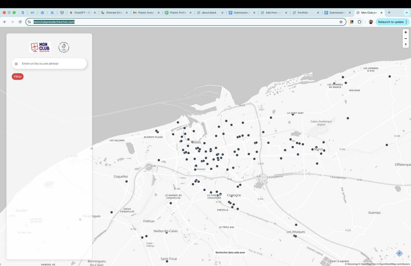
The real challenge: density + ambiguity
When your dataset is large and your source data isn’t perfectly structured, you face two simultaneous problems:
- Density: too many points in popular areas becomes visual noise
- Ambiguity: multiple locations per association makes representation tricky — you can’t just show “one pin per organisation” and call it accurate
A good locator solves both without dumping complexity onto the user.
Map JS: powerful, but only if you treat it as an interface layer
Woosmap’s JavaScript tooling is capable, but the quality of the result depends on how you use it.
We built a custom interface that prioritised:
- clarity at every zoom level
- filters that mirror how users actually think
- markers that communicate meaning, not just coordinates
- a predictable click journey (map → result → detail)
- performance that feels instantaneous, not “loading…”
This is where JavaScript skill becomes product skill: UI correctness is built, not configured.
The “association with many locations” problem
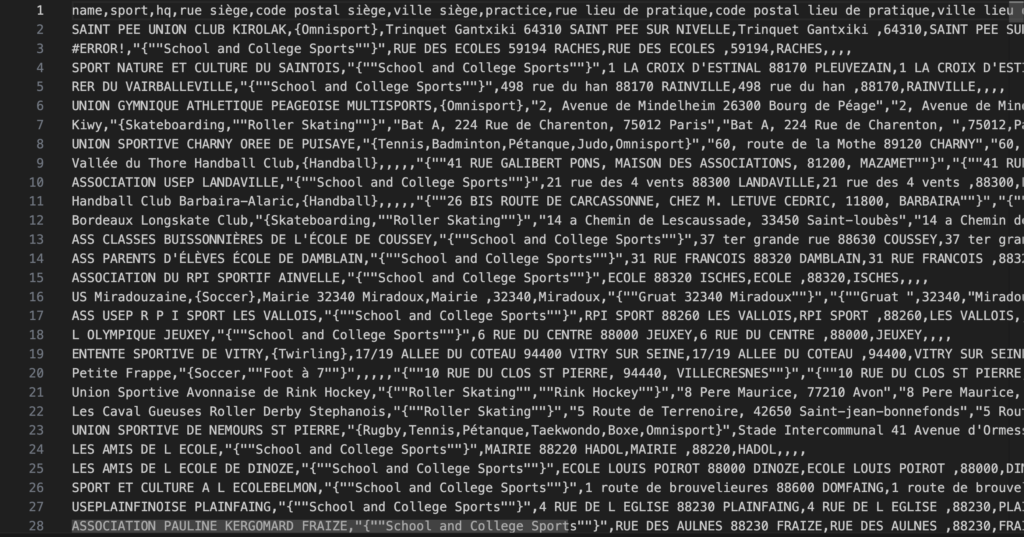
One of the most important parts of the build was handling associations with multiple sites.
If you model that poorly, you get:
- confusing duplication (“why does this club appear 8 times?”)
- incomplete representation (“why does it vanish when I filter?”)
- inconsistent detail pages (“which one is the real one?”)
We designed the browsing logic so the user sees what they need:
- a clean discovery experience
- accurate representation of locations
- a consistent path to the right detail
Filters that are actually usable
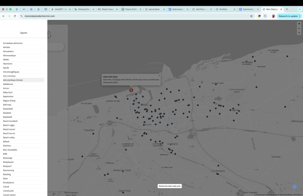
Filters are often treated as a database query UI. That’s the wrong framing.
Good filters are decision helpers. They should:
- narrow the world quickly
- help users understand what remains
- avoid “dead ends” where everything disappears
- stay responsive so users can explore without friction
We designed the filter behaviour to support exploration, not punish it.
Deadlines force honesty
The Olympic deadline forced the right discipline:
- no fragile experiments
- no “we’ll optimise later”
- no features that create support burden
The build had to ship with confidence. That’s why the combination of JavaScript knowledge and Woosmap knowledge mattered — you don’t get a second chance when the deadline is real.
The takeaway
This is the hidden prestige in projects like Mon Club: the hard part isn’t the map. The hard part is making a map product that stays coherent when:
- the dataset is large
- the underlying data is messy
- organisations don’t map cleanly to single locations
- users expect everything to be instant
- and you have a public deadline you cannot miss
That’s what “using Woosmap properly” really means.
Leave a Reply